Fall is here, and it's the perfect time for a photoshoot. But with so many colors to choose from, how do you know which ones will look best? In this blog post, we're going to dive deep into fall color palettes for men's photoshoots. I'll start by talking about fall colors and their significance in fashion, as well as how they can influence photoshoot themes. Then, I'll unveil seven unique fall color palettes generated by the artificial intelligence (AI) from OpenAI, DALL-E-3 and ChatGPT.
From embracing cool and calm tones to exploring warm neutrals, each palette has its own unique personality. I'll also give you tips on how to style outfits with these colors and enhance your photoshoot experience with the right lighting, natural backdrops, props, etc.. Finally, I'll show you what makes the Pantone Colors for Fall 2023 stand out and how I used DALL-E-3 to generate these amazing palettes. So get ready to step up your fall photoshoot game with these must-try color palettes!
Please remember that these palettes are only a guide and the result of my having a little fun with an Artificial Intelligence. AI is simply a tool to enhance creativity and productivity and the only way to learn about it is to play with it. You can get access to a free version of OpenAI's ChatGPT-3.5, Anthropic's Claude, and OpenAI's ChatGPT-4 through BingChat in Creative Mode.
If you are fascinated by AI and its potential, I invite you to follow some luminaries in the space. One person with his thumb on bleeding-edge information on artificial intelligence is Prof. Ethan Mollick of The Wharton School. I highly recommend that you follow him on LinkedIn and read his newsletter, One Useful Thing. Paul Roetzer of the Marketing AI Institute is another guru that I follow in this space. Great weekly podcast! 😉 Finally, my friend Dr. Marie Haynes has gone deep down the AI rabbit hole from the standpoint of Search Engine Optimization (SEO). She has a great weekly newsletter that's chocked full of the news and her insights on all things Google.
Understanding Autumn Color Combinations
Fall colors capture the essence of the season, radiating warmth and richness. Inspired by nature, fall color palettes feature shades like pumpkin, rust, and plum. The combination of warm tones and deep greens creates stunning palettes that add depth and visual interest to men's photoshoots. Embracing the autumn color scheme allows you to tell a vibrant and captivating visual story. These colors reflect the cozy and dusky tones of fall, adding a touch of warmth to your photos. Let's explore the beauty of fall palettes and how they can take your photoshoots to the next level.
Significance of Fall Colors in Fashion
Fall colors in fashion create a warm and cozy atmosphere, adding depth and visual interest to men's outfits. Rich tones like burgundy, sage, and cinnamon are perfect for fall fashion, bringing a stylish and cohesive look. By exploring fall color inspiration, you can stay on-trend with your wardrobe choices. Embrace the vibrant hues of this season's fall palette to elevate your fashion game or design a stylish living room. Dressing in these dusky tones will bring a sense of warmth and style to your brand story. Discover the perfect fall color combinations for a fashionable and on-trend look that will surely make a lasting impression.
How Fall Color Combos Influence Photoshoot Themes
When it comes to photoshoot themes, fall colors play a significant role in setting the tone and creating a warm and inviting atmosphere. The rich hues of autumn provide a beautiful backdrop for men's photoshoots, evoking a sense of nostalgia and coziness. By incorporating fall colors into props, backgrounds, and styling, you can enhance the overall theme and elevate the visual appeal of your photos. The warmth and richness of fall color palettes bring a touch of vibrancy that takes your photoshoot to the next level. So, when planning your next shoot, consider embracing the dusky tones of desert sand, the deep blues of teal, or the soft pinks of rose dust from the fall palette. Let the colors of the season enhance your storytelling and create captivating visuals.
Encourage natural poses that reflect the warmth of autumn and prompt playful interactions with fall foliage. Incorporate props that complement the fall color palette, capturing genuine moments of joy and connection.
Using Artificial Intelligence to generate Autumn Color Palettes
Discover the mesmerizing fall color palettes curated by DALL-E-3, designed specifically for men's photoshoots. These palettes strike the perfect balance between warm and cool tones, offering a visually stunning and unique visual experience. Step away from traditional autumn hues and explore new combinations that push the boundaries of fall colors. Taking inspiration from nature, DALL-E-3's fall color palettes blend shades like dusky desert sand, teal, and peach with pops of bright colors like rose dust and melon. These captivating palettes and take your wardrobe to the next level. There are a million different combinations that could be envisioned from the colors used, but I wanted to see if AI could generate better examples than I found on Pinterest. Only you can judge the results. Me? I'm learning what this AI can actually do. And, what it can't.
Why use Artificial Intelligence (AI)?
When you're looking for ideas for a wardrobe for a photo session, the first place I usually go is social media, i.e. Pinterest. The main reason I turned to AI was that I didn't like what I found on Pinterest for clothing suggestions "color palette for fall male photoshoot." Almost all ads! This result wasn't actually surprising because Pinterest is well-known to be utilized mainly by women. In fact, as of January 2023, more than 76% of Pinterest users were women. It's also THE PLACE its users go to shop with 85% of those who use the platform weekly making purchases based on Pinterest posts. The article I've liked to here is a treasure trove of demographic information on Pinterest, so please check it out.
Trust me, I'm NOT partial to DALL-E-3 as it still doesn't seem to compare to the output from Midjourney, but it IS now integrated with ChatGPT-4. This makes it very easy to go back and forth between text and image generation, all for the same subscription cost.
DALL-E-3 still cannot handle text no matter how hard you try to teach it. You can even tell it to not include any text and it will often not listen. It is still awfully biased when it comes to skin color, too, if you don't specify it. Finally, the results also go off the rails very quickly if you ask it to regenerate the images from the same prompt. Thus, I'm leaving the images as downloaded with all the goofy text attempts 1) in the interest of time and 2) to remind you that this technology is still in its infancy.
Oh well. I'll make do with what it is capable of at the moment. FYI, Claude was a lot less capable with the same prompts and cannot generate images as of this writing.
What Colors Were Used? Pantone's Fashion Week New York Autumn/Winter 2023/2024 Colors!
Let's use Artificial Intelligence to discover the perfect fall color combination for a guy's photoshoot. ChatGPT-4 and Dall-E-3 allow you to experiment with warm, rich colors that evoke the autumn season. Create a color palette capturing the essence of fall, from dusky brown shades to deep greens. Incorporate desaturated greens and dark slate tones for a sophisticated, masculine look. Find inspiration for fall color schemes beyond the traditional pumpkin spice palette.
The first prompt I tried was:
"Please generate 7 different color palettes for a man's fall photo session on location using the colors from Pantone's Colors of the Year 2023"
(HOT TIP: Saying "please" has been demonstrated to produce better results!)
ChatGPT-4:
"Pantone's Colors of the Year are selected annually and typically become a trendsetting concept for branding, design, fashion, and more. As of my last update in April 2023, I don't have the latest Pantone Color of the Year for 2023. However, you can easily use the chosen color as a starting point to create a variety of palettes that complement or contrast with it, depending on the specific color selected by Pantone for the year.
If you provide the specific Pantone Color of the Year for 2023 or describe it, I can suggest color palettes that would harmonize with it for a man's fall photo session. These palettes would generally include complementary colors, analogous schemes, or monochromatic variations. If the color of the year is a particular shade of green, for example, palettes might include earth tones, contrasting warm colors, or varied green shades for a monochromatic look.
Once you provide the Pantone Color of the Year for 2023, I can proceed to suggest these palettes."
What Prompts Were Used For Fall Colors Combinations?
To bring out the best in your subjects during men's photoshoots, use fall-inspired prompts. Be very specific in your prompting. For this particular photo session, I have a male subject accompanied by a young Golden Retriever, so I included it in the prompt.
Prompting the Fall Color Theme Palette Combinations
I asked ChatGPT-4 to generate 7 fall color palettes from the Pantone New York Fashion Week Colors for Autumn/Winter 2023/2024.
"Can you build me 7 different color palettes for a man's fall photo session on location from the following colors:
- 12-0912 Tender Peach
- 17-2624 Rose Violet
- 18-1750 Viva Magenta
- 17-1464 Red Orange
- 19-1555 Red Dahlia
- 13-0751 High Visibility
- 17-3934 Persian Jewel
- 13-6030 Carnival Glass
- 17-1544 Burnt Sienna
- 14-0255 Kohlrabi
- 16-1544 Persimmon
- 11-0608 Coconut Milk
- 19-3810 Eclipse
- 16-1333 Doe
- 19-0913 Hot Fudge
- 13-4403 Silver Birch"
ChatGPT-4:
I can provide you with a written description of seven different color palettes using the Pantone colors you've provided. Here are the combinations:
Fall Color Schemes Suggested by ChatGPT-4
Palette 1: Warm and Vibrant
- 18-1750 Viva Magenta - A bold and energetic magenta.
- 17-1464 Red Orange - A warm, fiery orange.
- 19-1555 Red Dahlia - A deep, rich red.
- 13-0751 High Visibility - A bright, attention-grabbing yellow.
- 16-1544 Persimmon - A lively, orange-red hue.
- 12-0912 Tender Peach - A soft, blush peach.
- 11-0608 Coconut Milk - A neutral, creamy white for balance.
Palette 2: Cool and Sophisticated
- 17-3934 Persian Jewel - A luxurious, deep blue.
- 13-6030 Carnival Glass - A muted, greenish aqua.
- 19-3810 Eclipse - A dark, almost black blue.
- 13-4403 Silver Birch - A light, silvery grey.
- 17-2624 Rose Violet - A vibrant, purplish pink.
- 16-1333 Doe - A warm, neutral beige.
- 14-0255 Kohlrabi - A light, fresh green.
Palette 3: Earthy and Natural
- 19-0913 Hot Fudge - A dark, rich brown.
- 17-1544 Burnt Sienna - A reddish-brown, reminiscent of autumn leaves.
- 16-1333 Doe - A soft, deer-like brown.
- 12-0912 Tender Peach - A gentle, flesh-toned peach.
- 19-1555 Red Dahlia - A deep, earthy red.
- 11-0608 Coconut Milk - A pale, off-white.
- 14-0255 Kohlrabi - A light, subdued green.
Palette 4: Bold and Dramatic
- 18-1750 Viva Magenta - A striking, intense pink.
- 19-1555 Red Dahlia - A dark, powerful red.
- 17-1464 Red Orange - A vivid, pumpkin orange.
- 17-3934 Persian Jewel - A royal, deep blue.
- 19-3810 Eclipse - A strong, navy blue.
- 17-2624 Rose Violet - A bright, floral pink.
- 19-0913 Hot Fudge - A solid, dark brown.
Palette 5: Light and Airy
- 13-4403 Silver Birch - A delicate, light grey.
- 11-0608 Coconut Milk - A clean, white neutral.
- 12-0912 Tender Peach - A soft, pastel peach.
- 13-6030 Carnival Glass - A pale, seafoam green.
- 13-0751 High Visibility - A pale, lemony yellow.
- 16-1544 Persimmon - A soft, muted orange.
- 14-0255 Kohlrabi - A soft, light green.
Palette 6: Muted and Modern
- 17-1544 Burnt Sienna - A rich, burnt orange.
- 16-1333 Doe - A warm, earthy tan.
- 19-3810 Eclipse - A deep, blue-black.
- 13-4403 Silver Birch - A modern, light grey.
- 13-2005 Soft Pink - A muted, millennial pink.
- 12-1403 Pale Pink - A soft, subtle pink.
- 11-0608 Coconut Milk - A soft, neutral white.
Palette 7: Autumnal Contrast
- 19-1555 Red Dahlia - A rich, maroon red.
- 18-1555 Vibrant Red - A bright, true red.
- 17-2624 Rose Violet - A deep, rosy purple.
- 16-1544 Persimmon - A warm, spicy orange.
- 13-6030 Carnival Glass - A muted, greenish turquoise.
- 17-3934 Persian Jewel - A dark, indigo blue.
- 19-0913 Hot Fudge - A dark, chocolate brown.
These palettes blend the vibrancy of fall with the sophistication of the selected Pantone colors, offering a variety of moods from warm and earthy to bold and dramatic."
Prompting the Fall Color Combinations for Posting to Pinterest
After some experimentation, I came up with the following prompt to generate images that would look good on Pinterest. For this particular photo session, I have a male subject accompanied by a young Golden Retriever, so I included it in the prompt. It also doesn't always listen to what it's being told with the latter words or directions having more weight. It seems to help if you put emphasis on terms you absolutely want it to follow by making them ALL CAPS.
"Create two hyper-realistic VERTICAL color palettes with a 16:9 aspect ratio that feature a color palette suitable for a man's and golden retriever's on-location photo shoot. The theme is “INPUT” You must use
- "THE LIST OF COLORS PREVIOUSLY GENERATED FOR EACH THEME"
The palette should include exactly seven color blocks, distinctly showcasing the main colors, plus two additional complementary colors that fit the theme. Each color block should be a solid, uniform color without any shades, gradients, or tonal variations." You MUST only show 7 color blocks, not circular palettes, no shades or tonal differences."
So, an example looks like:
"Create two hyper-realistic VERTICAL color palettes with a 16:9 aspect ratio that feature a color palette suitable for a man's and golden retriever's on-location photo shoot. The theme is Warm and Vibrant You must use
- PANTONE 18-1750 Viva Magenta - A bold and energetic magenta.
- PANTONE 17-1464 Red Orange - A warm, fiery orange.
- PANTONE 19-1555 Red Dahlia - A deep, rich red.
- PANTONE 13-0751 High Visibility - A bright, attention-grabbing yellow.
- PANTONE 16-1544 Persimmon - A lively, orange-red hue.
- PANTONE 12-0912 Tender Peach - A soft, blush peach.
- PANTONE 11-0608 Coconut Milk - A neutral, creamy white for balance
The palette should include exactly seven color blocks, distinctly showcasing the main colors, plus two additional complementary colors that fit the theme. Each color block should be a solid, uniform color without any shades, gradients, or tonal variations." You MUST only show 7 color blocks, not circular palettes, no shades or tonal differences."
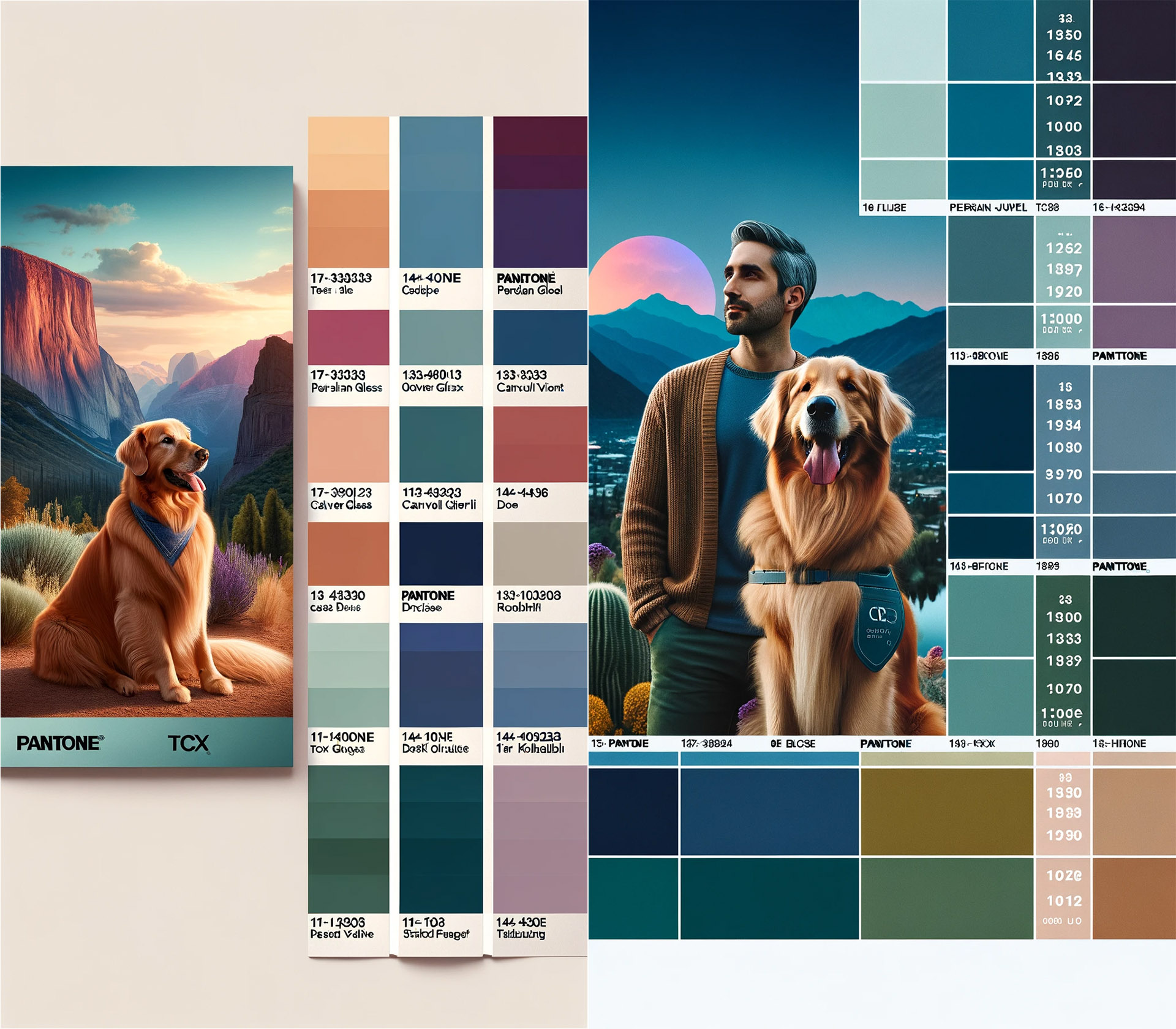
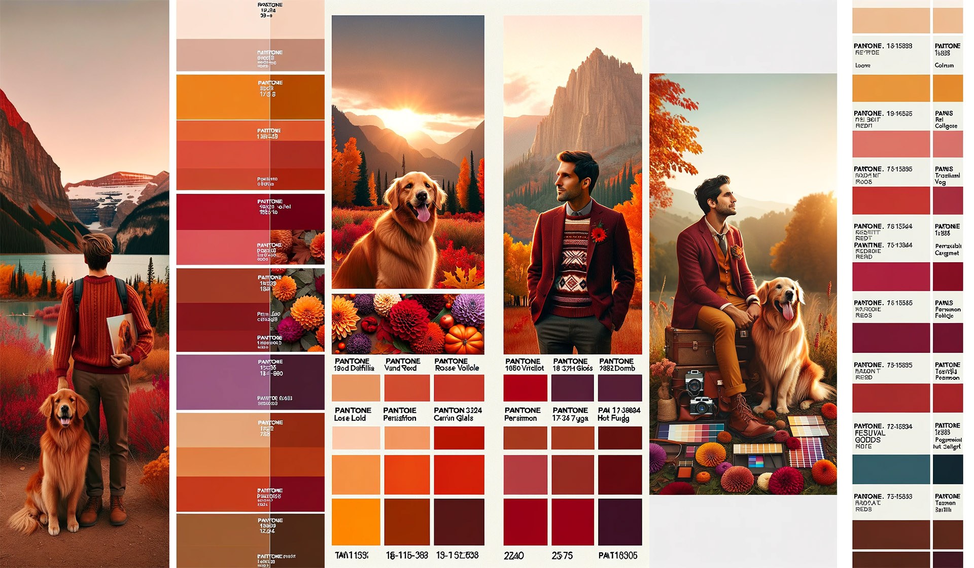
Unveiling the Fall Color Palettes Generated by DALL-E-3
Discover the mesmerizing fall color palettes curated by DALL-E-3 specifically for men's photoshoots. These palettes attempt to strike the perfect balance between warm and cool tones, offering a visually stunning and unique visual experience. Step away from traditional autumn hues and explore new combinations that push the boundaries of fall colors. Taking inspiration from nature, DALL-E-3's fall color palettes blend shades like dusky desert sand, teal, and peach with pops of bright colors like rose dust and melon. These captivating palettes and take your brand story to the next level.
Palette 1: Embracing the Cool and Sophisticated - Plum, turquoise, teal, ruby and beige
Embrace a cool and sophisticated look with Palette 1. This versatile color scheme features cool and muted tones of blue, gray, and green. Perfect for both casual and formal photoshoots, this palette exudes confidence and refinement. Capture the essence of fall while maintaining a refined aesthetic. It's particularly suitable for men's clothing like suits, blazers, and ties. Complementing each other well, these colors create a harmonious balance that adds depth and sophistication to your images. Take your photoshoots to the next level with Palette 1's cool and muted hues.
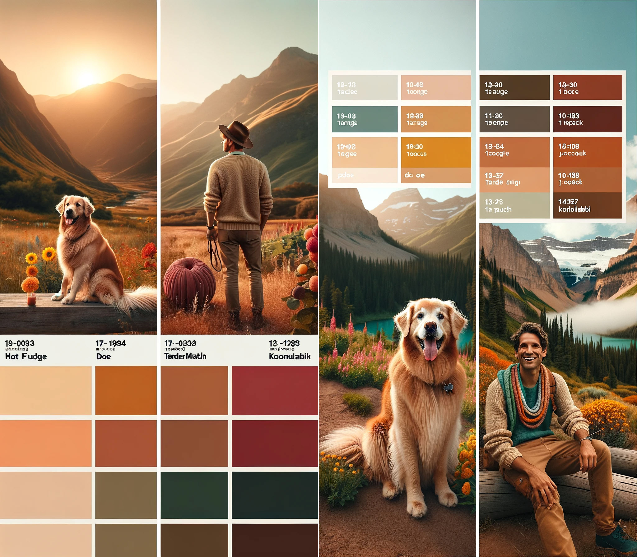
Palette 2: Reveling in the Earthy and Natural Tones
The Earthy and Natural Palette invites you to embrace the warm and earthy tones of burnt orange, khaki, and olive green. These colors effortlessly bring a natural and outdoor feel to your fall photoshoots. To add depth and contrast, Palette 2 also includes deeper shades like chocolate brown and forest green. The beauty of earthy tones lies in their ability to complement various skin tones while making clothing and accessories truly stand out. For a cohesive and stylish look, mix and match different shades from Palette 2 to create a captivating visual story.
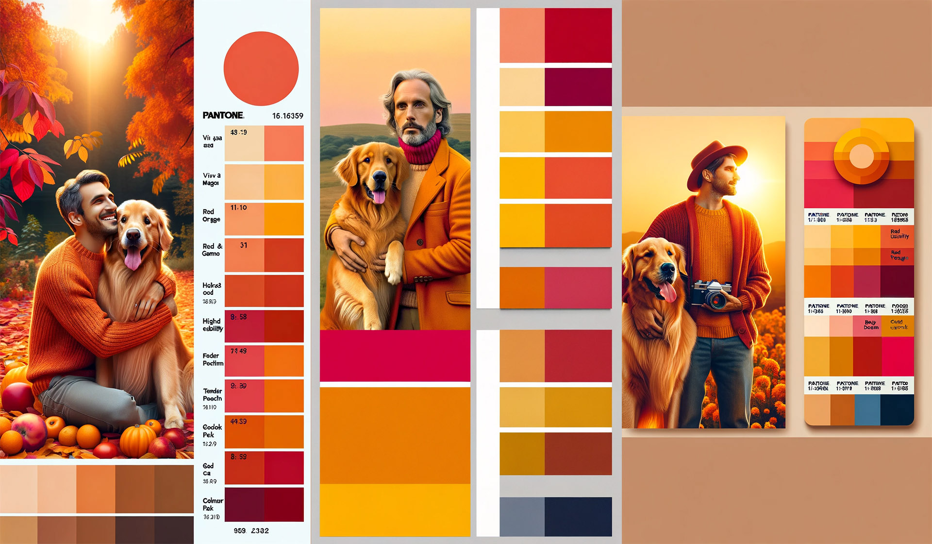
Palette 3: Exploring the Warm and Vibrant - Rust, melon, sage and pumpkin
Get ready to embrace the Warm and Vibrant palette for your fall photoshoots. This palette combines rich reds, fiery oranges, and sunny yellows to create visually stunning photos that exude a cozy autumn feel. With natural fall foliage as your backdrop, this palette is perfect for outdoor shoots. Experiment with different textures and fabrics to complement the warmth and vibrancy of these colors. Don't be afraid to mix and match complementary shades to create a unique and captivating look. Let your creativity soar and take your photoshoot to the next level with Palette 3.
Delving Deeper into the Color Palettes
Delve deeper into the captivating world of fall color palettes for men's photoshoots. Explore the power of different color combinations and how they evoke various moods and visual effects. By utilizing color wheel principles, you can create harmonious schemes that truly capture the essence of fall. Immerse yourself in the richness and versatility of these warm tones to tell captivating visual stories. Let your creativity soar as you uncover the perfect color scheme that brings your brand story to life. Discover the next level of visual storytelling with these dusky tones and vibrant hues.
Palette 4: The Play of Bold and Dramatic Colors
Experience the play of bold and dramatic colors in Palette 4. This unique combination of deep reds and rich greens creates a striking contrast against the natural backdrop of forests or parks. Whether it's a casual or formal photoshoot, these bold hues add depth and richness to your images. Stand out from the crowd with eye-catching photos that capture the essence of fall. Don't hesitate to experiment with this palette to create visually stunning and memorable shots. Get ready to elevate your photoshoots to the next level with this bold and dramatic look.
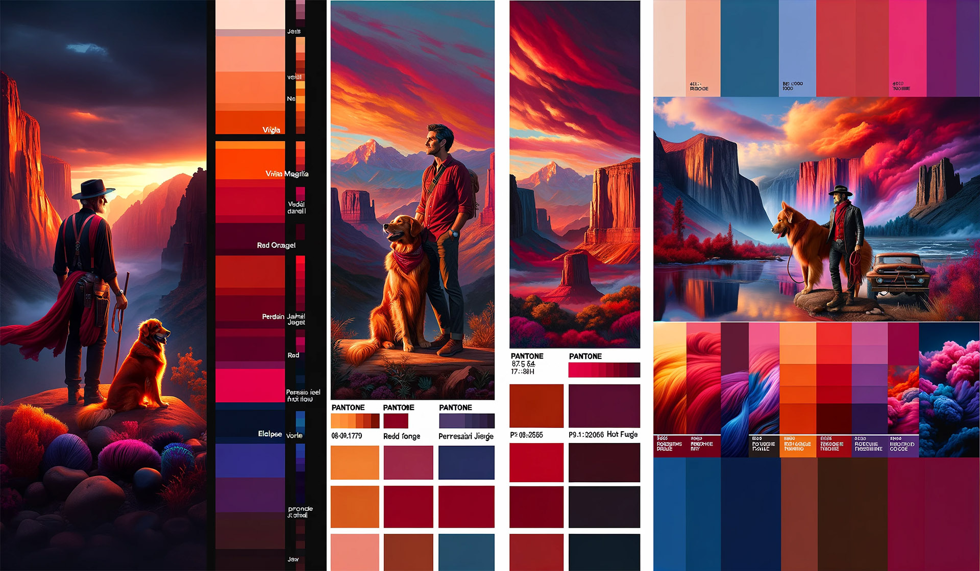
Palette 5: The Brilliance of Autumn Contrasts
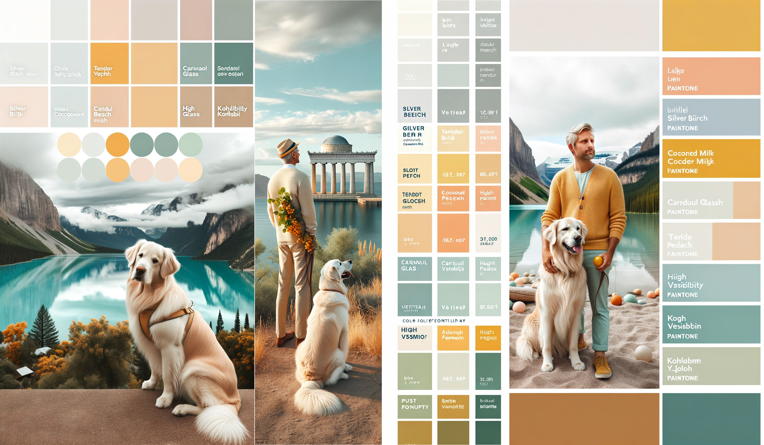
Palette 5 showcases the brilliance of autumnal contrast with its combination of vibrant orange and deep blue tones. This fall color combination is ideal for outdoor photoshoots during the fall season, especially amidst natural foliage. The striking contrast between the orange and blue hues adds depth and dimension to the photographs, making them visually captivating. To enhance the overall look, you can pair this palette with neutral colors like beige or grey. Whether it's a casual or formal style, Palette 5 brings a touch of vibrancy and sophistication to your photoshoots.
Palette 6: The Balance of Muted and Modern
Our "Balance of Muted and Modern," palettecombines muted earth tones with modern pops of color to achieve a perfectly balanced look. This versatile palette includes shades of olive, rust, navy, and mustard, complemented by accents of blush and teal. It is an ideal choice for fall photoshoots, as it can be adapted to various styles and settings. The muted colors create a cozy and rustic feel, while the modern accents add a touch of sophistication. With Palette 6, you can achieve a stylish and contemporary aesthetic for any men's photoshoot in the fall season.

Palette 7: The Light and Airy
Palette 7: The Light and Airy features gentle, muted tones complemented by pops of pastel colors. It is an ideal choice for outdoor photoshoots during the fall season, creating a captivating and ethereal ambiance in photos. The soft blush pink, light blue, and lavender hues harmonize perfectly with this palette. Whether it's a casual shoot or a formal one, the Light and Airy palette effortlessly enhances the overall aesthetic, bringing a dreamy touch to every frame. Embrace this palette to elevate your fall photoshoots to the next level of beauty and elegance.
I'll just add here that I sent this last prompt over to BingChat in Microsoft's Edge browser just to see if it would give similar results to it's twin sister over at OpenAI. Surprise, surprise!! It did a MUCH BETTER job of following the instructions! Here's one of the results. You can immediately see that it understands that I want a photograph generated rather than an illustration. It also followed my instructions for the color swatches almost to a "T." It still can't handle the text labels or count, but... Impressive. I'm going to have to force myself not to continue down that rabbit hole at the moment. Done is better than perfect. 😉


Tips on Styling with the Selected Autumn Color Themes
Consider the season and fall color schemes to find inspiration for your styling. Use the chosen fall color palette as a guide when selecting clothing, accessories, and props for your photoshoot. To add depth to the palette, incorporate rich colors like burgundy or plum. Look for visual assets such as plaid or Victorian patterns that complement the colors you've chosen. If you need inspiration, try using graphic design tools or free accessible color palette generators. These resources can help you create cohesive and visually appealing looks that enhance your fall palette.
Using the generated color palettes as a guide, you can create a cohesive and visually appealing look for a man's photoshoot. Here are some tips to style the fall photoshoot:
Outfit Coordination:
Choose clothing for the man that incorporates the colors from the fall palette. For example, for the "Light and Airy" theme, lighter shades like the pale grey, soft peach, or white would work well for his shirt or trousers.
Please avoid patterns that are too busy, as they can distract from the natural beauty of the setting and the dog. Solid colors or subtle patterns will complement the theme better. Long sleeves are generally your best bet, especially for those who don't like how their arms look in portraits.
Accessories:
Use accessories like scarves, hats, or watches that either match or provide a pleasant contrast to the chosen outfit colors. For instance, a watch with a leather band in the soft muted orange shade could add a nice touch.
For the dog, consider a collar, leash, or bandana that either matches the man's outfit or incorporates one of the palette colors.
Location and Background:
Choose a location that naturally contains elements of your fall color palette. For example, a sandy area for the tan and peach tones or a grassy field for the light greens.
Time the photoshoot during a part of the day when the light is softer, such as during golden hour, to enhance the "Light and Airy" theme and to give a warm glow that matches your palette.
Props:
Include props that fit the fall color scheme, such as a picnic blanket, cushions, or a vintage camera. Any props you use should blend in with the environment and not overpower the subjects.
Now, I'm not a huge fan of props because I don't like to distract from my subjects, but here's a list of props ChatGPT-4 thought might work with each of the color palettes I've shared.
Palette 1: Warm and Vibrant
-
- A sunflower yellow bandana for the dog.
- Tangerine and ruby red balloons for a pop of color.
- Bright blue ceramic bowls for a picnic scene.
- An emerald green throw blanket to contrast with the natural scenery.
- A vibrant pink frisbee or ball for playful shots.
- A pair of colorful sneakers for the man that match the palette.
Palette 2: Cool and Sophisticated
-
- A sleek, navy blue dog leash.
- A set of glossy, steel grey and ice blue accessories like a watch or cufflinks for the man.
- A pale lavender throw pillow for texture.
- A teal-colored scarf or bandana for the dog.
- A silver metallic water bottle or thermos.
- A crisp white fedora or sun hat for the man.
Palette 3: Earthy and Natural
-
- A moss green knitted dog sweater.
- A terracotta pot with a leafy, green plant.
- A wooden picnic basket filled with natural, beige linen and earth-toned ceramics.
- A caramel brown leather journal for the man.
- A sand-colored hat or boots.
- A rustic, olive green blanket for sitting or wrapping.
Palette 4: Bold and Dramatic
-
- A jet black, glossy collar for the dog.
- A crimson red jacket for the man, providing a stark contrast to the natural backdrop.
- A royal purple velvet cushion or throw.
- A bright, azure blue water bowl for the dog.
- A metallic gold chain or belt for a touch of luxury.
- A deep orange sun umbrella or backdrop.
Palette 5: Light and Airy
-
- A soft grey cashmere blanket.
- A coconut milk (white) picnic setup with a matching umbrella.
- Pastel peach and seafoam green cushions for a lounging area.
- A pale lemony yellow book or journal.
- A muted orange sun hat for the man.
- Light green, delicate glassware for a refreshing drink setup.
Palette 6: Muted and Modern
-
- A burnt orange modern art-inspired dog toy.
- A doe (tan) leather satchel for the man.
- Eclipse (blue-black) sunglasses or camera for an artistic touch.
- Silver birch (light grey) minimalist apparel for the man.
- Soft pink and pale pink small, stylish accessories like a phone case or wallet.
- Coconut milk (white) sneakers for the man, to blend with the background.
Palette 7: Autumnal Contrast
-
- A burnt sienna throw or jacket, complementing the golden retriever’s fur.
- A doe-colored woolen hat for the man.
- Eclipse (blue-black) boots or belt.
- Silver birch (light grey) dog bedding or resting mat.
- Soft pink and pale pink flowers or foliage for the set.
- Coconut milk (white) textured ceramics or mugs.
These props are chosen to harmonize with the respective color palettes while also being practical and enhancing the visual storytelling of the photoshoot."
Contrast and Complement:
Play with contrast by having the man wear darker shades while the dog has lighter colors, or vice versa. This will help both subjects stand out.
If the dog is a golden retriever, its fur will naturally complement earthy tones like soft peach and muted orange.
You can also use the Color Tools at Adobe.com to create your own fall colors that go together. Simply choose a color from one of the palettes using the color picker in Photoshop, like hex color #b50222 from the Warm and Vibrant Palette. Then use the Color Wheel Tool to choose the kind of palette you want to create, Analogous, Monochromatic, Complimentary, Split Complimentary, etc. and plug in that hex color into the first color block on the left.
Or, you can use the Extract Theme Tool on the second tab of the Color Tools to upload a palette or image you love the look of. The tool will then select colors for a Colorful theme, or you can request a Bright, Muted, Deep, or Dark theme be extracted from the image. If you choose None, you can move the color circles around to select the colors you like best to compare in the theme.
Consistency:
Keep the color theme consistent throughout the shoot, from the attire to the props and the setting. This creates a harmonious visual narrative.
Natural Elements:
Incorporate natural elements that reflect the color palette, like wood, stone, or plants.
If the shoot is in autumn, you can utilize the fallen leaves and the natural backdrop to bring in the color scheme.
Editing:
In post-production, gently adjust the photos to enhance the chosen color palette. Be careful not to oversaturate the colors.
Remember, the key to styling a photoshoot is to keep it natural and not forced. The colors should complement the subjects and the setting, creating a seamless look that feels both planned and spontaneous.
Creating a Cohesive Look with the Fall Color Palettes
To create a cohesive look with the fall color palettes, it's important to ensure that the colors work well together and are coordinated across different elements such as clothing, props, and backgrounds. Using similar shades or tones can help achieve a consistent and unified look. Adding pops of color can add visual interest and break up the palette. Experimenting with different combinations is key to finding the ideal counterbalance. By following these tips, you can create a visually stunning and cohesive look for your men's photoshoots.
Ways to Incorporate the Fall Colors into Outfits
When it comes to incorporating the fall colors into your outfits, there are several ways you can do so creatively. First and foremost, take inspiration from the fall color scheme itself. Experiment with different color combinations that reflect one of autumn themes and consider opting for color schemes that complement each other to create visually appealing outfits. Whether you prefer a more subtle palette with lighter tones or want to make a bold statement with rich colors, the choice is yours. Remember, the key is to have fun and express yourself through your outfit choices.
Enhancing the Photoshoot Experience with the Right Colors
Enhancing the photoshoot experience with the right colors is essential to create a warm and inviting atmosphere that reflects the beauty of the fall season. By choosing colors that evoke a sense of coziness and autumnal vibes, you can take your photos to the next level. Consider the warmth level and saturation of the colors to achieve the desired effect. Experiment with different fall color schemes to find the perfect palette that complements the theme or story of the shoot, creating a cohesive visual narrative. With the right colors, your photoshoot will exude the dusky tones and earthy hues of fall.
Utilizing the Natural Backdrop for Fall Photo Sessions
Utilize the vibrant fall foliage or local landscape as a natural backdrop for your photoshoots. Blend seamlessly with the surroundings by incorporating autumn colors like rust, ruby, and beige. Create a harmonious visual palette by incorporating the colors of nature, such as plum, sage, and pumpkin. Experiment with color combinations that mimic the richness and warmth of the fall season. To capture the essence of fall, integrate earthy tones like cinnamon and burgundy into your photos. Enhance the beauty of your subjects by utilizing the natural backdrop provided by Mother Nature herself.
The Impact of Lighting on the Chosen Autumn Color Scheme
Considering the impact of lighting on the chosen color palettes is crucial in photography. Lighting plays a significant role in how colors appear in your photos. Experimenting with different lighting setups can enhance the richness and vibrancy of the colors. For a cozy, autumnal feel, warm and soft lighting works best. It creates a welcoming atmosphere and complements fall colors. On the other hand, introducing dramatic lighting brings contrast and visual interest to your photos. It can amplify the impact of the chosen color palettes and add depth to your images. Being mindful of how lighting interacts with the colors is essential to achieving the desired effect.
What Makes the Pantone Colors for Fall 2023 Stand Out?
- Trend Relevance: Pantone is known for forecasting color trends that resonate with the current cultural, economic, and social climate. The Fall 2023 palette is chosen for its relevance to contemporary design trends and consumer preferences.
- Versatility: The colors selected for the season typically offer a range of hues that are versatile enough to be used across various industries, from fashion and beauty to interior design and product packaging.
- Color Harmonies: Pantone's seasonal palettes are designed to work well together, providing harmonious color schemes that designers and consumers can use to create cohesive looks and products.
- Innovative and Fresh: Pantone often introduces new shades that feel innovative and fresh, encouraging designers and brands to explore new color combinations and concepts.
- Narrative and Emotion: Each color in the palette often comes with a narrative that connects with emotions and experiences. For example, a color might evoke a sense of comfort, warmth, or stability, which can be particularly appealing in the uncertainty of post-pandemic times.
- Global Influence: Pantone's color selections are influenced by global art, entertainment, fashion, design, and lifestyle trends, as well as socio-economic conditions, making them globally relevant.
- Sustainability: With a growing emphasis on sustainability, the Fall 2023 colors might reflect natural tones that suggest a connection to the environment and eco-friendly practices.
- Technological Advancements: The development of new pigments and materials can also influence the standout qualities of the seasonal palette, incorporating the latest in coloration technology.
Each year's selection is a reflection of extensive trend analysis and is meant to inspire and guide the creative industry for the upcoming season. Pantone's Fall 2023 colors continue this tradition, offering a distinct and directional palette that captures the essence of the time.
Conclusion
To capture the essence of fall in your photoshoots, it's important to understand the significance of fall colors in fashion and how they can influence your photoshoot themes. By exploring different fall color palettes, you can create a cohesive look and enhance the overall photoshoot experience. With the help of DALL-E-3 and ChatGPT-4, I have generated seven unique fall color palettes that embrace the cool and sophisticated, revel in earthy natural tones, explore warm and vibrant colors, play with bold and dramatic colors, showcase the brilliance of autumn sunsets, balance muted and modern colors, and offer the harmony of the light and airy. These fall color palettes provide endless possibilities for styling your outfits and utilizing the natural backdrop to create stunning fall photos. So, embrace the beauty of fall and elevate your photoshoots with these captivating fall color palettes. And try out OpenAI's ChatGPT-4 and DALL-E-3 yourself and let me know what fall color palettes you come up with!